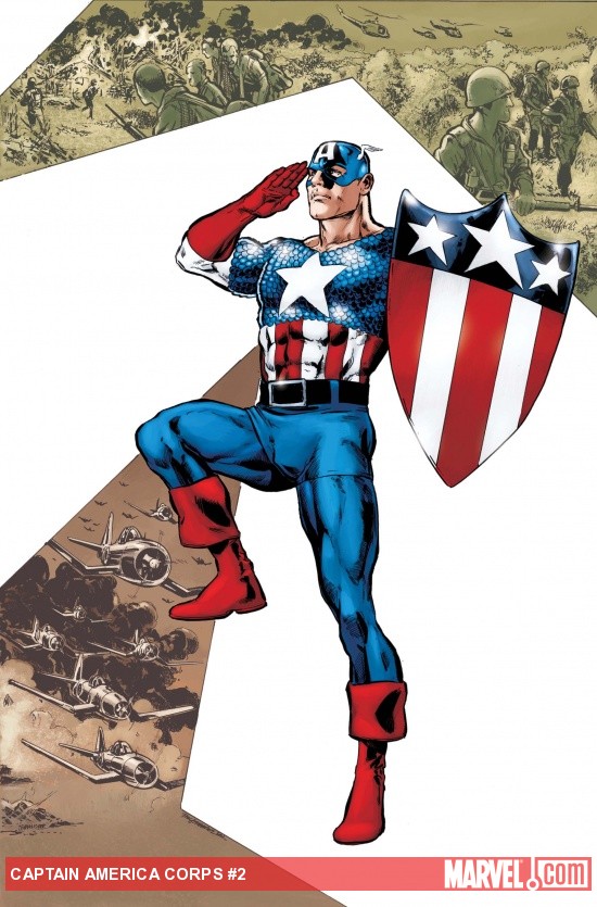
Captain America Corps #2
Written by: Roger Stern
Art by: Philippe Briones
Last month I had a pretty slow week in comics when 'Captain America Corps #1' came out. So I might have had a bias in regards to actually enjoying a comic when nothing came out for me. Roger Stern has been given reigns of putting together a team of Captain America's to fight some big evil that.....well that hasn't really appeared yet.
This wasn't a bad comic by any means, it was just boring. I think Stern has a good voice for the characters but he doesn't do anything but the obvious with them. Except for the best Captain America in the group: USAgent. If Marvel would give Stern hold of a USAgent mini then I'd buy that in a heartbeat. He's such an angry, politically incorrect man in this mini that it's always comical whenever he opens his mouth. But other characters, like American Dream or even Bucky-Cap, add nothing but generic characterization. Hell we're almost halfway done the mini and we still don't have a grasp of the villains in this. They seem to be doing something with multiple Steve Rogers but it never gets explained. Oh and judging from the design of 'Bright Star' (what a name!) Marvel might be hearing from DC considering she looks EXACTLY like Liberty Bell right up to how her hair design.
Last issue I was impressed by Philippe Briones art, even if it had some bizarre anatomy for the characters. Unfortunately this issue seems to be plagued more with weird facial designs and somewhat confusing flow of the panels. There are some nice pages in here, like the first two page spread with USAgent fighting Ameridroid, but they are few and far between. Heck look closely in some of the better pages and you got some wonky character designs. At least with the Corps members they are mostly hiddenn in their costumes; other characters (like Peter Parker) are down right unrecognizable in their regular clothing.
So I guess the mini's true colors are revealed by being a bland, uninteresting comic. There is some craziness (or maybe even fun) to this mini but for the most part this was not much fun of a read. Briones pencils don't add much to them by giving us bizarre looking characters and some unnatural movement between panels. Maybe when it's all collected this will be a fun romp in the Marvel Universe. As it stands now though, I'd say you should save your money for Brubaker's Captain America title.

FF #9
Written by: Johnathan Hickman
Art by: Greg Tocchini
The last issue of FF was by far the worst of the series to date. It had a confusing story and more importantly a pretty shitty artist on board. So instead of moving away from all the Inhuman's mess, Hickman once again goes further into the ressurection of Black Bolt. Also we still have Greg Tocchini as artist.....This is gonna be a long read....
To be fair, let me put Hickman down on this review too because he's also the culprit of some bad choices in this issue. There is absolutely no drama in this story. Even if you read the entire Abnett and Lanning space opera (especially with War of Kings) you still wouldn't find much enjoyment out of this. We get a confusing mess of Black Bolt, somehow, returning to his people and also getting right into the War of the Four Cities. You'd also think that the return of a somewhat major character would be dedicated to a few pages of happiness with his people. We don't get any of that. Black Bolt quickly gets back on the throne and the characters pretend he never left in the first place. Again with no real drama or stakes so far with his return, I get the feeling that Black Bolt isn't really important to the story even though that can't be the case here. Also, whatever is integral to Ronan the Accuser didn't make much sense but hopefully Hickman will use it to some degree in the future.
After this issue we have to hope that Marvel, DC, or any other comic company will never hire Greg Tocchini again. His pencils, once again, are just laughable and just plain unfinished in some cases. It's a shame because there are flashes of some decent layouts. The panel of Black Bolt fighting the tentacle monster, or his ship landing on the Moon should be impressive. But instead they are drawn very lazily and his inking actually 'smushes' the art to make it look more ugly. His character's are also a joke, with some looking like they are missing their skull or their eyeballs are completely missing. The drawing of the Evil Reed Richards towards the end is a joke.
Thankfully, and don't call this a spoiler because I am saving you right now, Steve Epting seems to be back on the book next week. Let's pray that Tocchini will never get involved in an integral book every again. But blame should also go to Hickman as well because he tells a boring and somewhat confusing mess of a return for Black Bolt. Yes he might be important to the 'War of the Four Cities' storyline, but there was absolutely no reasoning behind these two issue fillers that you couldn't tell in a single issue. I still want to say that FF is the best Marvel book being published now, but this two issue arc definitely hurt that title thanks to some poor writing and shitty art.

Wolverine and Deadpool: The Decoy
Written by: Stuart Moore
Art by: Shawn Crystal
When you have a slow week in comics like myself, it helps to try out new things. Sometimes a comic will grab your attention with an interesting cover, or a bizarre premise, or having a favorite character appear as well. This one-shot, which was originally an original comic for 'Marvel.com' has all three of those ideas in mind. It has a great cover by Skottie Young, a bizarre team up, and it has one of my favorite character's with Deadpool. So I forked in some extra cash to get this money, what is the harm?
While I wouldn't say that I wasted my money on this, it definitely feels like Marvel is cashing in on something that was (possibly) easily available on their site. Then again we all know I am not a fan of digital comics and Marvel does a pretty poor job of making digital comics accessible. But it's easy to tell they didn't bring the 'A' talent with them for this one-shot. It might be a little unfair to Stuart Moore but let's face it, this is a pretty generic story. Wolverine is in the middle of a fight with a big robot when he realizes that he needs a distraction (a 'decoy' if you will) to have any chance of winning. A few pages later convincing the Merc with the Mouth and you got yourselfs a team up. The problem is two-fold. For one thing the story is pretty generic. The second problem is that this is as simple as you can get with characterization. We learn nothing about these two but then again if your big baddie is a generic looking robot then I guess you weren't expecting much of a story.
Then we have the art which can be all over the place sometimes. I like Shawn Crystal from other Deadpool projects because he brings a cartoony element to the characters. There are some good pages in this like Wolverine remembering Jean Grey, or the reveal of the ultimate plan with Logan and Wilson. But between those great pages are wonky character designs and changes in anatomy. Wolverine is the big culprit here as his head changes shape in every panel. Plus the action left me with something more including the robot's deathrays which look pretty lame.
This one-shot also has a reprint of an old Deadpool story with Fabian Nicieza, Dan Slott, and Nelson. While it's great to see an old, and even better, Deadpool story reprinted that brings the most obvious to the table: The reprint is much better then what is the marketed story. Moore and Crystal try to do their best but in the end it's just a generic story involving a robot. You can't get any more basic then that in a Marvel comic book these days.

Xombi #5
Written by: John Rozum
Art by: Frazer Irving
We are on our penultimate issue of Xombi, which will sadly end next month. It's been a fun ride but now John Rozum has to finish his tale in hopefully the most bizarre way possible. Also, lots of action might be included. While last issue suffered a bit from a rushed but obviously so exposition this issue has....well it has more of the same.
Don't get me wrong, this was fun to read as always. But it seems like Rozum is waiting for the very last issue to give us some explosive action. What we get here is a chase between two floating castles (of course) while character prepair for the confrontation. We get a bit more insight into how these type of castles are going about and of course the explanation is ridiculous. But there are some nice character moments between Kim and the rest of the cast. It's a bit of a shame we see that too because Rozum obviously has a great voice for all these characters. While it is crazy and enjoyable, it's sad knowning that there is so little Rozum can do now that the book is cancelled.
Frazer Irving delivers more on the crazy including biblical giant skeletons, people with eyeballs for heads, and seemingly ghosts with invisible swords. It's all par for the course in this series and Irving executes it beautifully. There are some amazingly drawn panels where it looks like your living in a painting. From the very first page to the giant pterodactyl egg it all looks realistic. Again it has a painted feel to the pages instead of the obvious digital quality to them. It helps that the unique coloring of bright oranges, muted greens, and pinks that keep the book visually interesting. Irving is showing, with this title anyways, on what you can do with being a digital artist. People like Mike Deodato could learn a thing or two from this book.
So it looks like next month we'll get the final confrontation between David Kim and Finch. This issue reminds us what could've been with the series with great character moments and more ridiculous premises that are downright awesome. The issue also shows more of the incredible talent of Frazer Irving and how gorgeous digital art can actually be. While it's sad to see it go, we still have one more issue to go. I'm gonna enjoy this series as much as I can until reality kicks in next month.
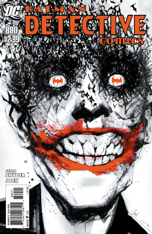
Detective Comics #880
Written by: Scott Snyder
Art by: Jock
No matter who you are in the comic world, it must be difficult to write The Joker. Being around since the very beginning of Batman's career, there have been countless portrayals of the villain. His personality changes from writer to writer and sometimes you could have two different tone's of the characters running around in the same universe. So now that we have Scott Snyder handling the character I only have one question: Will I need to sleep with the lights on tonight?
That answer is undoubtly yes because Snyder writes one disturbing Joker. At first I thought he was jumping on the Grant Morrison bandwagon on the level of craziness. But no, this is his own spin on the character and it's disturbing to read. It's also fun though (if you're sick like me) who finds enjoyment on just how crazy this Joker is. It helps that letterer Jared K. Fletcher uses a different font for the clown and it's like reading messages in an insane aslyum. There is more to the comic though then Joker, which Snyder also does a great job with. Dick shows off his detective skills, another great moment between Dick and Jim, and Oracle plays a good mix into the issue too. It's moments like these that show just how characterization and in-depth moments between characters are integral to Snyder's writing. We've seen Gordon as a main character in other Batman comics, but not to the level that Snyder perfectly writes in each issue.
Jock comes back for the final two issues of the series and I think I'm finally at a point where I can finally see how great of an artist Jock is. The way he layouts a page, or how he draws a finely detailed Gotham city, to the lighting effects (with help from Dave Baron) this book sets the mood of the script quite well. Jock also handles some of the more disturbing moments of the script including my panel of the week: The reveal of Barbara (the wife) in the shower. I'm gonna be afraid to go into my own shower after seeing that image. It should also be sad how interesting Jock's take on Joker is. He kinda looks like a rock star with having a buzz cut and a nice suit and jacket on. While Snyder provides the chilling dialogue with Joker, Jock adds to the insanity by the way he draws his eyes. I've seen madness in the eyes of someone before and Jock draws it perfectly here.
We have one more issue to go until the end of this run by Snyder and the reboot begins. This issue continues to show why Snyder is downright perfect for the Batman no matter who is under the cowl. He just gets the entire character; from the supporting cast to the corrupted city he lives in. It also doesn't hurt that he writes one hell of a Joker that rivals that of Grant Morrison's take. Add in some fantastic pencils by Jock and you got yourself one hell of a comic. Snyder did warn us that the next issue is going to be very disturbing. Not sure how he can top it with this issue, but I know he can definitely do it.
No comments:
Post a Comment