
Written by: Scott Snyder & Scott Tuft
Art by: Attila Futaki
It's amazing just how far a man's mind can go to tell a story. Scott Snyder certainly has shown his horror chops in a lot of his work. But this time, it feels like he is going to tell us (along with Scott Tuft) a full on horror story instead of telling horror on the side like in Batman or American Vampire. You certainly have a lot going for this book to scare you: Hobos, cannibal murders, and a general sense of doom are throughout this comic book. If you're like me and you got excited with the word 'hobos' in that last sentence, then this is a comic for you.
This issue both Snyder and Tuft decided to get us more introduced to the children in this tale. While I'm not up on my 1910s lingo, I like the dialogue throughout the issue. It makes it feel very authentic and the writers definitely put in a lot of research for the setting. What makes this series, and this issue, work for me so far is the more disturbing moments. It's not like Snyder or Tuft is going full frontal with the horror here, they are going with the slow burn for this series. So one moment we'll have a chilling idea of two men 'advancing' on kids, the next we'll have a few pages of building up to seeing a corpse of another kid from the previous issue. It's a nice balance and it keeps you on your toes throughout the issue as you turn the page. I certainly couldn't tell what was going to happen next as it kept going.
I really do love the style of the art used in this series. Futaki's painting style sort of makes it feel like your looking at a painting from Norman Rockwell and the like. While I don't recall Rockwell drawing a dangling corpse or a tattooed cannibal, the painted style makes it a delight for the eyes. Even if you don't want to see what's going to happen next...The coloring is also pretty good too with a muted, sometimes eerie feel to it. Lots of browns to indicate were on a train car, but then he'll use slight purples or oranges to indicate dusk. Sometimes the faces can look a bit stiff or unemotional but for the most part this is a gorgeous looking issue.
This is an eight issue maxi series and were only on issue two with a very slow burn. Normally I don't like when comics are this slow in terms of delivering the plot, but here Snyder and Tuft are crafting a brilliant but equally disturbing story. The last image of this comic is not only drawn beautifully by Futaki, like the rest of the issue, but it's so disturbing it's a little hard to swallow looking at it. We haven't scratched the surface with this mini and I'm already unsure whether I want to continue....In a good way!

Written by: Duane Swierczynski
Art by: Jesus Saiz
So far the new #1 comics by DC have been a bit hit or miss for me. The hits have been knocked out of the park while the misses have been mixed. Most of the misses I did enjoy (with a few exceptions) but I didn't think it warranted an ongoing read. For this new incarnation of the Birds of Prey team I wouldn't normally think twice about picking it up. But then the creative team was announced and I was not prepared at all. Duane Swierczynski as writer and Jesus Saiz working together? Considering Swierczynski is a very underrated writer and Saiz drew one of the best DC books recently (Brave and the Bold) suddenly I was all over this book.
Unfortunately I hate to say that this issue just didn't do enough for me. On a technical level, nothing is particularly wrong with it. Swierczynski introduces us to two members of the team (Black Canary/Starling) during a rescue mission. The action sequences are drawn really well by Saiz and it's clear that he wanted to impress quickly with a lot of one page spreads of big moments. The moments with Black Canary on the car are easily the best moments of the book. What I didn't like about this issue is that Swierczynski didn't do a whole lot else to get me intrigued for the future of the book. Except for the final two pages, this could easily been a quick one-shot of some action packed moments with some of the females of the New DCU. Instead it feels like Swierczynski told 18 pages of a fun action film but then quickly had to throw in some plot at the end to make it 'interesting'. With some of the other pages in this book, Saiz doesn't get much to work without outside of the high flying moments. It's mostly talking heads and when it isn't talking heads, he frames parts of the action with close up of the characters. It's weird on why Saiz made these choices considering the previous titles he's worked on.
If you want a fun, action packed comic involving some badass girls of the DCU; then this is the book for you! When you look closer at the issue however, you see a lot of cracks at the base. We only get a few of the full team with not much going for them apart from a daring rescue mission. Plus I never understood why Black Canary is considering a criminal with only a casual mention of it. Add in some mixed art decisions by Saiz and it's a pretty disappointing issue as a whole. In the long run, maybe this series will read a lot better as one whole story. As for now this is just one mindless action packed issue with cramming some type of plot at the end. Just not what I'm looking for in a new book, especially with a great creative team coming from these two.

Written by: Paul Jenkins
Art by: Bernard Chang
Before the New DCU we had a team up series with 'Brave and the Bold'. A series I really love partially because of JMS writing it but also because I love comics that involve team ups. I've read a lot of 'Brave and the Bold', 'Marvel Team Up', and other books like that since then and for the most part they've been fun to read. Now we have a new 'team up' book of sorts with DCU Presents, which will follow different characters in the new universe. First up we have Deadman, a character who has had a ton of exposure even before the relaunch. What new story could be told this time?
Paul Jenkins has had a ton of criticism over the last couple of years and it's well deserved. This is coming from a man who wrote 'Sentry: Fallen Sun', easily one of the worst comics to come out in the 21st century. So of course reading anything by him is going to be a bit weary to me. For the most part this is a good retelling of Deadman's origins with the start of his first mission. I like we're getting a blank slate with the guy because I couldn't get into him much in the old DCU because I never knew about him before. The problem with this comic is that Jenkins is trying to fit too much into a first issue. If this was just a Deadman origin then I would be fine with it, he needs a fresh start. But Jenkins tries to juggle too much by rushing into his origin and then going into this complex story of what his mission needs to be. I like the idea that he's constantly jugging going into people trying to help them....But then it instantly reminds me of Quantum Leap so it's not that original of an idea. Then you have the Bernard Chang art which is good, but doesn't do much for me in the long run. He does a very good job making sure every person in the panel looks different, especially in the carnival sequence. Plus his interpretation of Deadman's 'balance' of life and death is a nice image. But for the most part it's more of a talking head issue or just close ups of other characters he's inhabiting. Also let me point this out: The colorist is name 'Blond' which might be the stupidest name I've ever heard.
It's a shame this book couldn't impress me for another issue because the premise is sound. A nice, clean slate for Deadman is a good start but Jenkins just put too much on the table for a first issue. If it was just an origins issue I'd be okay with it, but as it is it's too much to fit into twenty pages. The art by Chang almost saves it but it's not enough for me to try it as an ongoing. I'll definitely give it a shot in trade especially once we get past the Deadman story.

Written by: Kyle Higgins
Art by: Eddy Barrows
Over the summer I got introduced to a brand new writing with Kyle Higgins. Along with Scott Snyder he wrote a fun mini-series with 'Batman: Gates of Gotham'. While the debate of who exactly wrote what is up to debate, it was clear that Higgins also had a great knack of writing Dick Grayson. Speaking of which, Grayson had a great time at being Batman but now he's back (some say demoted) to Nightwing for the New DCU. While it's going to take some time seeing Dick back in his old costume, I'm excited to see where Higgins can take himself without another writing at his side.
For the most part, I had nothing to worry about because this was a really fun issue to read. Yet another book where the character has to be reset, it still feels fresh without feeling like Higgins was forced to bring it all back. Grayson is cocky but still smart enough to realize that being Batman hasn't made him a better superhero. While he isn't fighting villains though, we get to see a nice addition back to the character with his circus troupe coming back to Gotham. While Higgins is obviously setting the place up for the future it's nice to see that Higgins brings back Dick's past without making it feel shoehorned in. The only problem I had with this issue is that towards the end, Dick totally let a couple of cops get killed. Now maybe Higgins had no perfect way of Dick changing into costume, but just letting two cops die seems really un-Dick like. (Actually it makes him like a Dick...HA! Get it?...eh)
Eddy Barrows hasn't been the most watched artist in my book for the last year. His run on Superman certainly didn't help with some very uneven and downright ugly pencils in my mind. Here though he's going full out Neal Adams (not the first artist lately to mimic him) on his layouts and it's all for the better. The beginning train sequence looks really good and so does the circus scenes. Although his character models are still pretty funky to me. I mean I know Dick used to be a great trapeze artist but those other trapeze artists are a bit too 'excited' to see him work it. That and a few moments of action involving blood, especially with the cops, look a bit too cartoony.
Color me impressed, seriously. I did not expect to enjoy this issue all that much when I first picked it up. But Higgins definitely got me with a great voice for Dick Grayson and Eddy Barrows art looks really good here. There obviously needs to be some better choices in the future, especially with Dick making sure to SAVE some people and Barrows art could be more refined. As a whole though, this is definitely the most surprising comic for me for the New DCU.

Written by: Jonathan Hickman
Art by: Nick Pitarra
Jonathan Hickman unfiltered can definitely be a bit of a mixed bag. This coming from an uber-Hickman fan by the way. Sometimes his own creative owned work can be compelling like Nightly News or Pax Romana. Other times it feels like the ideas were certainly more better in his mind, then what's put on paper. So far, Red Wing has fallen under the latter with virtually no character development with only two issues to go. Nick Pitarra's art though has certainly saved this mini from being a trade-wait to a must buy. Can the momentum keep going with the penultimate issue?
I'm not lying when I say there is no character development in this story. I still know very little about these three cadets then I did before. It certainly doesn't help that with Rosenberg's ugly colors, it's hard to distinguish any of them (including the lone female surprisingly) with no features wearing the bland uniforms and equally uniformed chins. I still enjoy a good time travel story though and the thoughts on the subject is perfectly represented here. It's a shame that the actual story being told here is hindering the best parts of the issue. However, bland coloring aside, Pitarra is still killing it with this mini. There is so much detail in this issue it's hard where to start. How about that amazing four page sequence of the 'Wings' attacking the base? Or that lovely image of someone disintegrating by not using their ship properly? Seriously I could see endless amount of pages of that drawing. There's also some nice touches like seeing individual wrinkles on (visible) faces of characters or the tiny pieces of debris floating in space. The art is definitely the one big reason to keep reading this mini to the end.
It's a shame that Hickman seems to really not have thought out a decent story out of this. The philosophy on time travel is compelling enough but it's bogged down by characters I could care little about. If it wasn't for the horrible coloring by Rosenberg then Pitarra's art could shine fully here. But his pencils are more then enough to warrant a read here even with said coloring. I doubt we're going to get much satisfaction at the end of this mini except for Pitarra's art.

Written by: Peter Tomasi
Art by: Fernando Pasarin
While Geoff Johns 'Green Lantern #1' has left a bad taste in my mouth, Peter Tomasi back on the Corps has got me really excited. His original run on the title quickly became one of my favorite DC books because he put so much care into his characters. Yes he had literally billions of characters to worry about, but he was able to balance it month in and month out. Even with big events he was able to put his own character moments with each issue. Now with the "New" DCU for the Corps we seem to be back to square one with most of the characters. But considering this book will most likely be tied into the original Green Lantern book I very much doubt anything is 'fresh'.
Still, this was a fantastic issue because Tomasi was able to do two things which I thought was impossible. One, he made Guy Gardner likable and two he actually puts good use to John Stewart! All at the same time too by giving us an insight into why being Corps members isn't actually easy on Earth with everyone knowing your identity. I love it that even though we do get a touch of smugness in the beginning, Gardner is actually trying to do something good by being a H.S. football coach. Then we get an equally badass moment of Stewart laying some smack on corporate nobodies too. These were such great ways to not only introduce the characters but to make them instantly likable. Now apart from some grisly moments in the beginning and end, the actual plot hasn't kicked in just yet. But if this is anything like how Tomasi introduced the 'Batman and Robin' villain from last week then I'm excited on how disturbing this storyline could get.
I never read the 'Emerald Warrirors' comic from before so Fernando Pasarin is a bit new to me. Overall I liked most of what I saw here especially on how real everything felt. There is an insane level of detail in these pages and right from the beginning it's hard not to notice. So much care is put into the face of that random jailed prisoner on Oa I'm shocked this issue came out on time. His art can be a bit stiff at times though and his take on Gardner can be all over the map at times. I didn't even recognize him until his ring appeared at the end of his introduction. But I like the art overall in this issue so it's not much of a deal breaker for me.
This issue did everything that 'Green Lantern #1' didn't. First, Tomasi introduced all the characters with interesting situations and made them likable. Then you get introduced to this mysterious threat that is not only interesting but disturbing at the same time. Add in some insanely detailed pages by Pasarin and you got one gorgeous looking space drama book. It's like Tomasi never left this book to be honest. While I shutter to think this will get tied into GL in the future. Right now I'm gonna enjoy this ride and see where Tomasi and Pasarin is gonna take it.
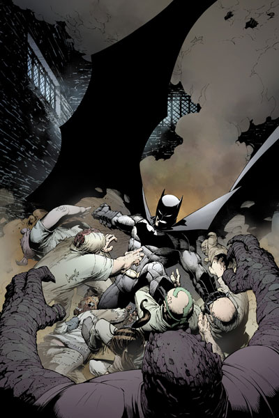
Written by: Scott Snyder
Art by: Greg Capullo
We've all seen how hype can not only help a comic, but also hurt it as well. Sometimes a comic can really deliver on it's promises, while other times it will fail miserably after one issue. Scott Snyder must have certainly knew this while going on his constant plug for his new run on Batman. Not only is this run going to connect to his previous run on 'Detective' and 'Gates of Gotham' but the message is basically clear on all this hype: This is going to change Batman forever when it's all said and done. It is a lot of pressure and the future seems very promising for Bat-fans. So I guess all I can ask is: Is this all hype?
For the most part, this is a very very strong issue. From the opening page to the final reveal there is a lot to like here. First we get a great narration of what 'Gotham is' which Snyder balances perfectly with an opening Arkham breakout. When it's all said and done you get a long, but certainly intriguing look into the mindset of Bruce for the future of Gotham and the characters who will populate the run. Then we have a disturbing crime scene and chilling message to end the issue. All of those moments are great and Snyder writes them perfectly. However, as first issues go....It's great, but not what I was expecting. Snyder, as usual, seems to be going for the slow burn on this run so not much is stated here other then the message towards the end. While hints of the villain for the run is here, it's weird we get no real visual of who or what it is. Again if it's a slow burn of a story it's fine. But Snyder seemed to hype it up to the extent that a lot was going to happen right off the bat, but it didn't. It really didn't hamper the issue for me in any way, it's just strange we didn't get right to the crux of the story so quickly.
The real question of this new run is Greg Capullo. An artist I didn't think much of until the reveals of certain pages, both for this and future issues, got me real excited. For the most part I like what I see. His style is really unique because it's a dab of cartoony visuals mixed with ultra-violent images. His take on Batman has this animated feel to it and I only connect it that way because of the chin. His chin matches the Bruce Timm chins of so many DCAU characters. His take on other characters like Gordon, Bullock, or others feel just as simple but there is a bit of detail to make them stand out. His Gordon looks like any other guy, but he puts so much detail into his hair (and that awesome mustache) that he has a unique take on the guy. Sometimes his drawings don't pan out too well, like his seemingly realistic (by which I mean gross) take on Two-Face and his other versions of the classic villains. That Joker, even if it is a switch at the end, still doesn't look right to me. Overall though I was pleasantly surprised on how much his style, as much as a 90s take it is, worked for the story.
I have no doubt that Scott Snyder is going to be writing one of the best runs on Batman. This issue is a strong start but the hype he laid out before the release did hamper it for me a little bit. Mainly that it's a slow first issue with a lot of build up and no big reveals or story beats just yet. Greg Capullo's art though definitely got to me in the first page and he will definitely be the right fit for this dark tone for the series. Maybe the hype didn't translate into a POTW for me, but it's still an excellent first issue with a lot to be excited for the future.

Written by: Jeff Parker
Art by: Declan Shalvey
I am so perplexed onto why Marvel is still continuing with the idea of a '.1 issue'. The research has shown that the sales has not increased dramatically to have a 'jumping on point' issue nor have most of them worked in any way to make it an easy access for new readers. So I was really not looking forward to getting a .1 issue of a series I had no real need to catch up on. (Yes I know I didn't have to get this, but bear with me I'm going somewhere with this..) When I was done reading this issue though all I had was one thought: "That's how you do a .1 issue Marvel!"
One of the things that hit me too about this issue is that, boy it's been a while since we've seen Luke Cage hasn't it? He's been sorta missing because of the various events for Marvel so the leader of the main team has not been around for a while. In this issue he returns to help try and find the rouge T-Bolts and almost everything he said made me chuckle. He has this no non-sense attitude but he quips so many times here that almost everything had me laughing. Then we have other underused characters for a while with Ghost, and especially Songbird (it's her issue) and again I do forget just what this series used to be before Parker added dozens of other characters to the mix. The 'jumping on point' for this issue seems to be the remaining T-Bolts trying to find the rogue team while Songbird remembers her past with a convenient plot device. But the obvious flashbacks work pretty well here and Parker seems to be setting something up for future issues is apparent. (How big to small it is in the future is left up in the air for now)
Declan Shalvey. Here's a guy who's gotten his share of fame now with this title and he feels so underused. Don't get me wrong every issue he does, including this one, are beautiful to look at. But it feels like he should be having another ongoing series after so much work put into this one series. You get a great opening sequence of the T-Bolts fighting a one-eyed monster and it gets better from there. You have a river of souls, great panel layouts in the dream sequences, and the most badass looking Spider-Man you'll ever see. (There! Go put this man on Amazing Spider-Man and I'll buy it!) You're just not going to find a lot of artists with this type of style and yet it fits so perfectly for this series. If it wasn't for Kev Walker being slightly slow on deadlines we wouldn't be seeing such great work today.
I am just as surprised as you are that this is my favorite book for the week. It does everything that a .1 issue is suppose to do though. It reintroduces the characters and gives us some insight into one of them to get us intrigued for future issues. But as a regular reader it got me happy to see underused characters, like Cage, because Jeff Parker is so good at writing them. Add in some outstanding pencils by Declan Shalvey and it might be the best looking .1 issue I've seen for this idea. I'm glad I picked this up because if I didn't I would have missed out on a fantastic issue for an already fantastic team book. Definitely pick this up if you were unsure of it before or if you're a new reader.
No comments:
Post a Comment