
Written by: Greg Pak and Fred Van Lente
Art by: Neil Edwards
After six issues I think I finally got the tone for this series. This has a very 70s, B-movie vibe in the same vein as The Warriors or Death Wish. If you think of the comic that way, then maybe you'll find some quality in this comic. But for me that's the only time the word 'quality' will pop up in this review. After slogging through this series for six issues, this has finally made me decide to drop the character I once loved.
Everything about this comic is dull or easily predictable. In terms of the story you can see where it's all headed. From the characters changing sides, to the villains deciding to fight for the hero, to the inevitable end; you all see it coming. The fighting isn't that remarkable and the villain is just a generic tough guy. The art doesn't help either because Neil Edwards makes every character look stiff in each panel. It looks like they are posturing for the reader instead of seeing believable 'movement' in each panel. Also, the characters seem to change facial structure each panel. I'm also starting to think Edwards like the trace his work because the faces he does draw consistently look very similar.
This is so sad for me to type because I love Hercules. When I got back into comics, Incredible Hercules was my go to book to enjoy everything about the industry. Now it feels like Pak and Van Lente are cashing it in for a paycheck instead of telling a good story. The bland art doesn't help the fact that this can be a very boring book at times too. The issue ends with everyone cheering and Herc proclaiming 'Brooklyn's my town!'. All I kept thinking while reading this was: 'No it's not'.

Written by: Jonathan Hickman
Art by: Dustin Weaver
Alright I can't defend this series anymore. I love ya Hickman but I gotta face it: I have no clue what's going on here. It's been well over a year with only eight issues and so far nothing has really been explained.
Each issue seems to be the same. We get a little (key word: LITTLE) insight into a character, this case being Di Vinci, and then the rest of the issue rambles with about the end of the world with no explanation on how that's gonna happen. This issue finally made me realize that why Issac Newton is definitely the villain of the story, I have no idea why. He just screams that the world is gonna end then he suddenly time travels to the future (of course). Plus Leonid has had so little characterization in this long run that I have no idea why I should care for him. He's suppose to choose who to follow but because Newton and Di Vinci are so stereotypical good and evil separately the choice is pretty damn obvious. The only characters I really care for are Nathaniel Richards and Howard Stark. I hope we see more of them before the end of the series.
The only thing that keeps me interested in this comic is the GORGEOUS artwork by Dustin Weaver. Every panel is filled with so much detail it's astonishing. I mean the opening panel of Florence and Di Vinci's home has so much detail in the buildings and the technology it's hard to pick just one thing out. I personally love how he handles the action moments of the book, like Richards shooting a beam at Newton and the device slowly comes back to pieces. A lot of credit should go to colorist Sonia O'Back because she makes the book colorful and more interesting to look at.
So it's really more of the art that is keeping me a float in this series then the story. Plus, considering it's a bi-monthly title it's hard to considering dropping it since it takes so long for each issue. But let it be known that this has been a chore to read because Hickman seems to care more about the ideas in this series instead of fleshing it out. To this day I still have no idea why I should care about anything going on in this book. Especially the Star Child who literally appears out of no where at the end of the issue. At least it's a pretty damn gorgeous book to look at.
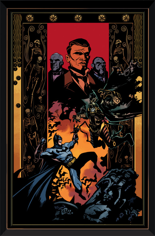
Story by: Scott Snyder and Kyle Higgins
Written by: Kyle Higgins and Ryan Parrott
Art by: Dustin Nguyen and Derec Donovan
Let me tell ya a funny story while I was reading this comic. I was going through the issue as normal, and something just wasn't quite right with it. I kept thinking: 'Gee, Trevor McCarthy (the artist) had a Dustin Nguyen look to his work but he really is aping him this issue.' It bugged me to no end because the jump between the previous three issues to now is really jarring. Then I get to the final page of this issue and I suddenly laughed because: Dustin Nguyen actually did this issue! I know, I couldn't believe it myself!
I'm not sure why Nguyen (and someone named Derec Donovan) is now on this mini but it is a bit better then seeing McCarthy's pencils. I feel bad saying it but I question why Nguyen couldn't have done this mini from day one. Nguyen is great at mimicking other artists (see Batman and Robin on his take of Andy Clarke) so he is definitely trying to keep the style consistent from previous issues. But add to the fact that he had to clearly rush this issue, it's not the best looking comic. All the character's anatomy and faces changes constantly and it might also have to do with the fact that this Donovan guy trades pages with Nguyen. Donovan's pencils (which are mostly the flashbacks but he does some other 'present' pages) are much cleaner but it does mesh with Nguyen's pencils. But there are moments, like the beginning fight scene, where it shows the detail Nguyen puts into each page.
This issue also suffers from feeling kinda rushed. Which is a bit understandable since this mini has to end right before the reboot. But unlike the previous issues I don't see a lot of story but quick fight scenes and a convenient way for the Bat-family to get back at 'The Architect'. The flashbacks are still nice to read and they have been the high points of the mini. But now with this new guy, Ryan Parrott writing with Higgins and no trace of Snyder in any of these pages (at least that I could tell) and it feels almost like a completely different story). It's a shame, because the Snyder/Higgins team up was working so well before.
At the end of the day these changes didn't hurt the issue for me entirely. This is still a fun Batman mini and I'm glad I decided to buy them now instead of waiting for the trade. But it's clear that this had to get rushed to be finished before the September reboot. The change in tone with a different pair of writers and the change in artists definitely threw me for a loop. If THIS particular team is the same for the last issue it won't bother me too much. But it is a shame that we couldn't keep the original artist and Snyder's touch for the entire mini.

Written by: Jeff Lemire
Art by: Pete Woods, Cafu & Bit, Paulo Siqueira & Andrew Magnum, and Pier Gallo
Sometimes when you have a list of artists on a cover, it can be worrisome. Mostly because if there's that many people (and this isn't an anthology issue) then the mix of completely different style of artists could be bothersome. But with Lemire giving us a clever reasoning behind the mix of artists and having a strong duo of colorists by their side, then you could have an enjoyable issue with a huge amount of artists. At least I hope we do...
There isn't much to say about the overall story in that it isn't a special as the art in this issue. But I will say that Lemire definitely makes me want to have a Phantom Stranger ongoing in the worst way. This is basically a Phantom Stranger issue because we see his thousands upon thousands of years fight with Tannarak and how the evil magician seemingly comes back to rule the world. Even though this should be a Superboy book first, it's nice that Lemire took the time to bring more history with these characters which somewhat amps the conflict in the present day. Also, I'm surprised Lemire is so good at the magical elements of the DCU and it makes me wonder if he could do a magic book in the future for DC.
Onto the art though and it's the real highlight of this issue. Again this issue shows why colorists are important other then obviously coloring a book. Because artists like Woods, Cafu, Siqueira, and Gallo are completely different in style the colorist have to somehow manage to make them look similar. By using the same palette for each sequences, colorists Jamie Grant and Dom Regan are able to make each sequence look very similar. Pete Woods section taking place in 45,025 BC (so specific) to Gallo's present day pencils look eerily similar. But with how each artist layout each sequence you can see the different between them. The opening splash page in particular by Woods is really impressive which is something you wouldn't hear often by me in regards to Woods.
So this issue is more of an art tour de force then anything else. But Lemire does a pretty good job giving us a nice backstory with Stranger and Tannarak for making me actually care what is going on. But let's give it up to the amazing colorists for this issue to show just how an 'anthology' like issue can be done. For so long we can see how a colorist can somewhat ruin a comic, but here we see how they can save an issue. Also, the four artists here aren't slouches in their own right.

Written by: Scott Snyder and Scott Tuft
Art by: Attila Futaki
Scott Snyder sure has been busy this summer. If he isn't working on Detective Comics or American Vampire; he's mixing it up with other writers to give us enjoyable mini-series. First it was 'Gates of Gotham' and now we have 'Severed'. Okay, I'll admit that hearing it was another vampire story did make me question the need for this mini. I mean how many times can Snyder go to the horror well, let alone a vampire well again? But boy I shouldn't question the man at all at this rate. He's pretty much batting a thousand with the debut of this mini.
It's quite obvious that tension is going to be the name of the game this mini. We get a little glimpse into the backstory of the main character, but it's all about being unnerved by what's going on around him. Whether it's dealing with hobos on the train, or an elderly man in an abandoned house Snyder and newcomer Scott Tuft handle the tension so well. I feel like the more I read Snyder's work the more likely he'll give me a heart attack one of these days. (That's a compliment btw Snyder). I feel bad ignoring Tuft for the most part in this review but it's only because I don't know much about the man. The bio in the back is helpful but I'm not sure what is his stuff in this issue and what's Snyder's. Hell most of it feels like Snyder so again it's hard to tell.
What isn't hard to tell is how amazing the artist is. Apparently this is Attila Futaki's first major work into comics and boy how did anyone miss this guy before? I adore this painted style he has and it reminds me of Jon J. Muth and his OGN 'The Mystery Play'. The page of Jack looking back at his home in the middle of the night looks something straight out of a museum. But I also like the muted colors in his work, whether it's the light greens in the daytime settings or the grays used throughout the night settings. Just an absolutely gorgeous looking book.
So yes it's another horror comic, possibly involving vampires, by Scott Snyder. But don't judge the book too quickly until you read this, trust me. There is a lot of tension throughout the issue and the gorgeous artwork by Futaki is worth the price of admission. I can't wait to see what more disturbing elements this story has in store with Snyder, Tuft, and Futaki.

Story and Art by: Jeff Lemire
Now that's how you make a comic book!
The last couple of issues of Sweet Tooth have been pretty standard I must say. Lemire is telling a pretty good story here but the art has been so 'normal' by his standards I was wondering if Lemire had no more tricks up his sleeve. But then I go right into this issue and boy it got me for the rest of the book. Jose Villarrubia has been the rock for this series, by making Lemire's pencils look a little different his his coloring. But for once, I think in general as well, Lemire takes a stab at coloring in this issue and boy should he do it more often. The entire dream sequences is drawing by Lemire and he uses watercolors to showcase the dream. This comic is so far out in terms of what's going on. Gus is going into skulls, seeing a massacre in a snowfield, and ending up floating on a boat at the end. It all looks so god damn gorgeous it's hard not to keep these pages still to see the entire detail of the sequences. The pages that don't showcase the dream are great in their own right, but Lemire kinda takes Villarrubia out of the equation for this particular issue.
So all I can say about this issue is: I want more Watercolors by Lemire please!

Written by: Jeff Parker
Art by: Declan Shalvey
Last issue of Thunderbolts I made POTW because of the fantastic sequence of Juggernaut's mind with Shalvey's art. While this particular issue didn't have any of that going for it, it still was an enjoyable and good looking comic to boot.
Jeff Parker is able to balance a lot of plot points into each issue I notice. Not just because he's got to juggle literally fourteen characters at once, but because a lot seems to happen here. The Thunderbolts have to deal with Juggernaut, Satana is trying to get them out of there, Baron Zemo suddenly comes into play, and of course we need to have more Kaiju monsters at the very end to balance out all the craziness. Parker is able to deal with each plot point very well and give it enough pages for us to really care about it. The final line, by Warden Walker pretty much sums up the entire attitude of the craziness. Also, I really hope we get a Kaiju title in the future for Marvel because unless you want to buy the Godzilla books, then you can only get it here.
Shalvey is also able to keep the madness going with some great pages in here. The highlight is obvious the page where Shalvey splits it in half where Moonstone is trying to stop the nuclear rocket in time. I also like how Shalvey is able to use the edges of the comic to show something fall down. He did it in that Crossbone's one-shot a few months ago and it still works here. Also, the two page spread of the monsters attacking the beach is quite enjoyable to look at. There's so many monsters on that spread, you can see his work on the 28 Days Later comic helps him here.
I was so worried that Fear Itself was going to hamper this title like so many others. But Jeff Parker has been able to make this an enjoyable arc so far by putting a lot (and I mean A LOT) of plot into each issue but makes it fun to read. It also helps that Declan Shalvey has been killing it with the art for the past two issues. This issue just continues to confirm that Thunderbolts is the best Marvel team book on the stands right now. How much more can go on in these pages next time?
Good idea to have all your reviews in one place
ReplyDeleteThanks. It'll be a good way to get more traffic too. So literally hundred of people can see them!
ReplyDelete